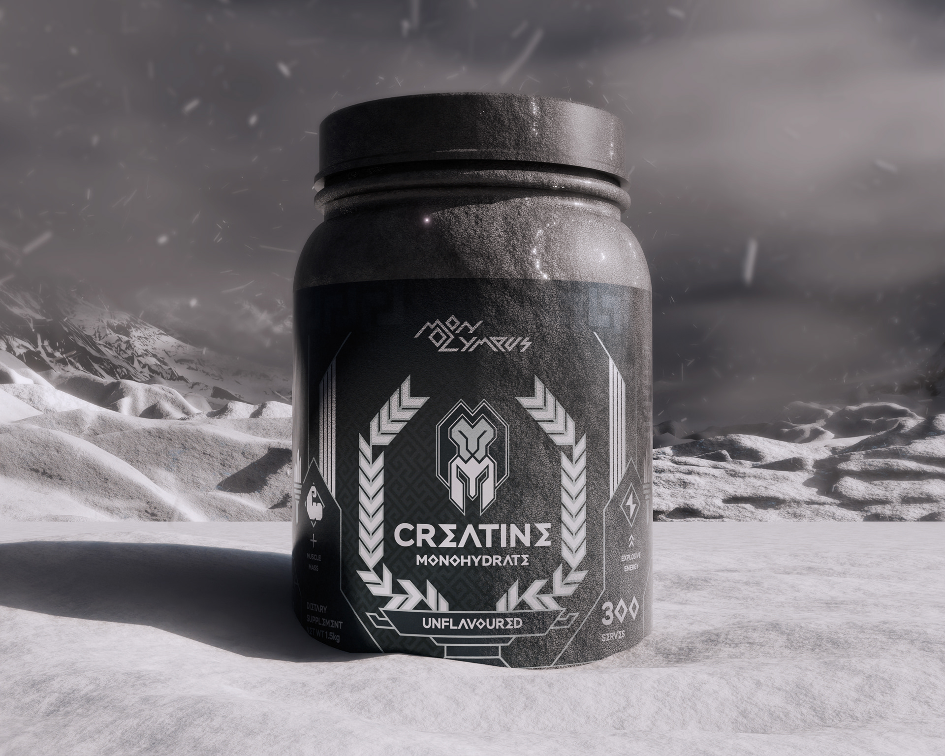
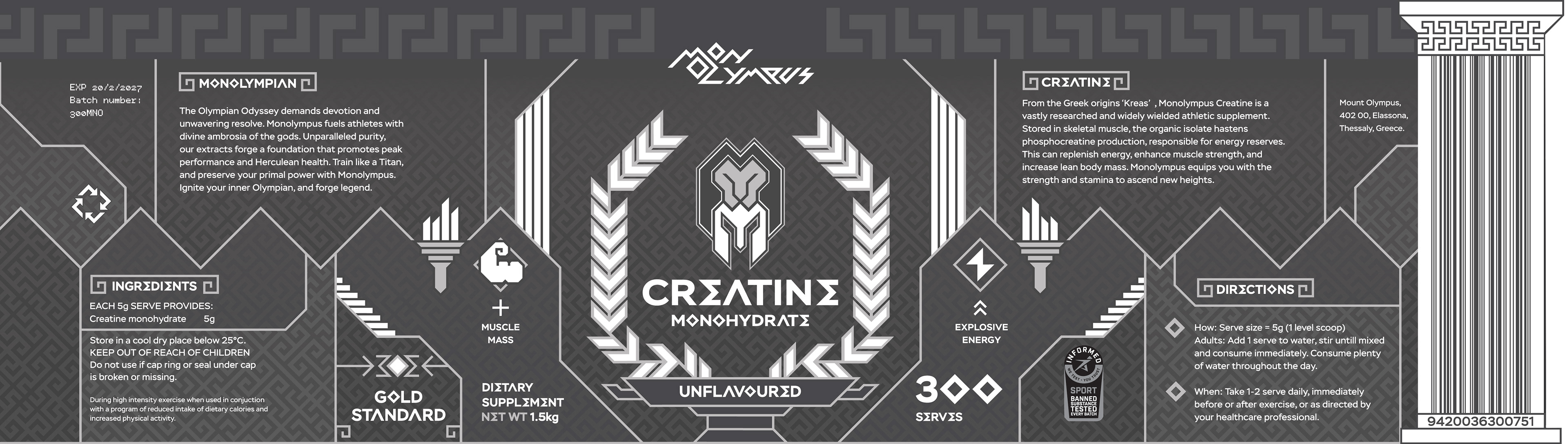
Inspired by The Olympians, Hercules, and Greek mythology, I developed a complete brand identity for a creatine monohydrate product. This included a packaging design with a creative barcode that adhered to strict global standards.
Monolympus blends Creatine Monohydrate with Mount Olympus, the home of the gods. Mono reflects singularity, the one to ascend new heights, who dares to stand amongst the gods.
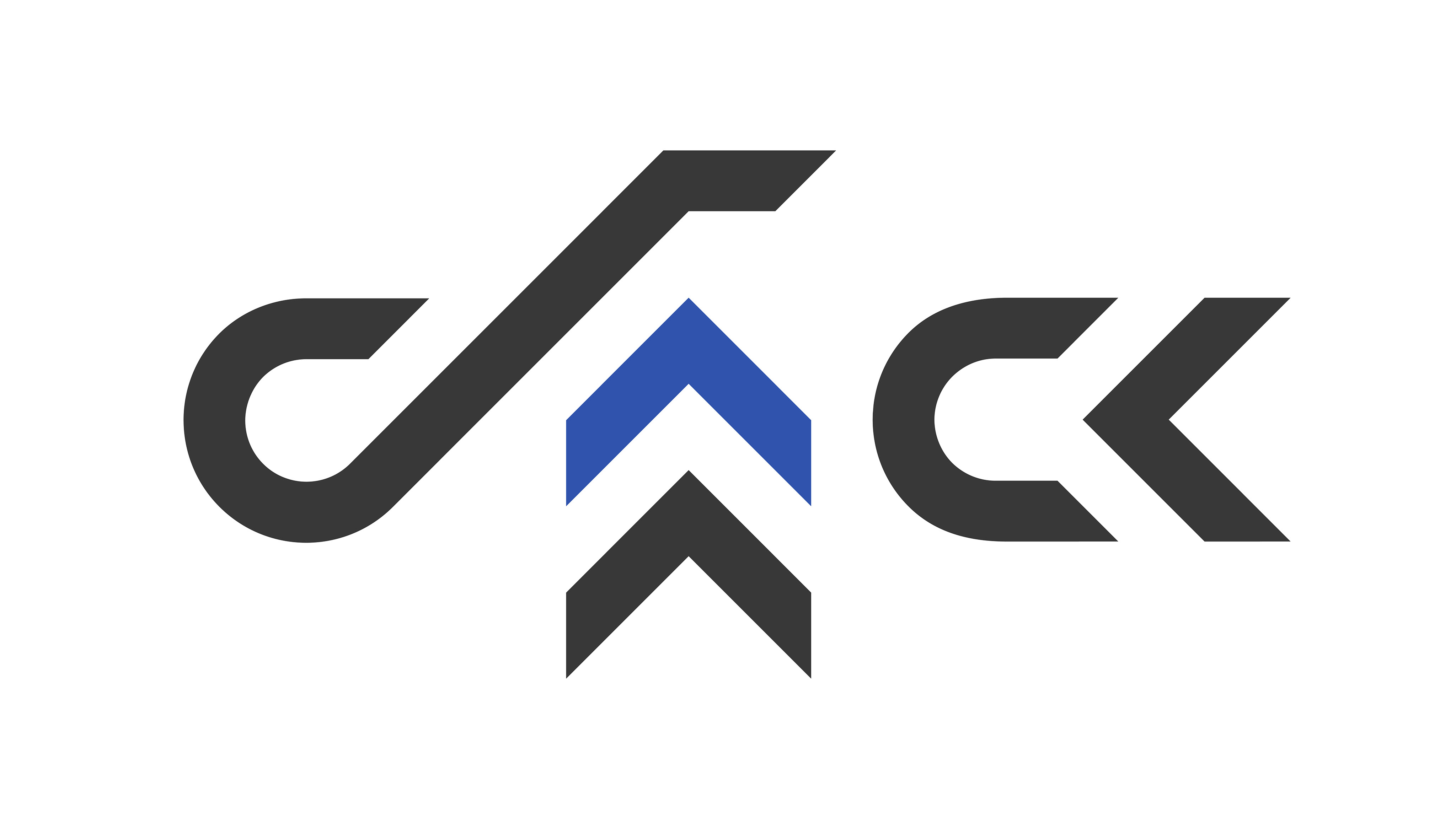
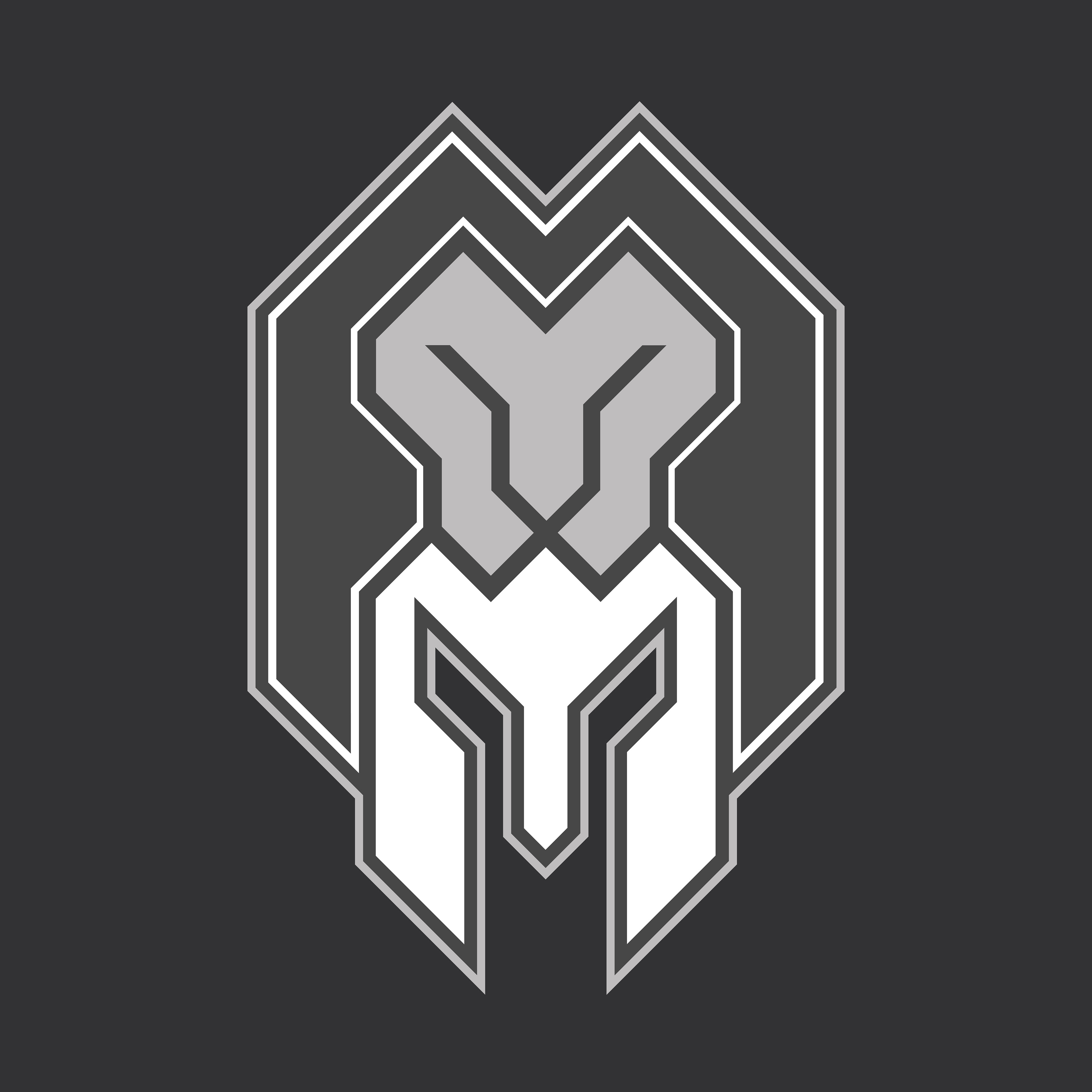
LOGO
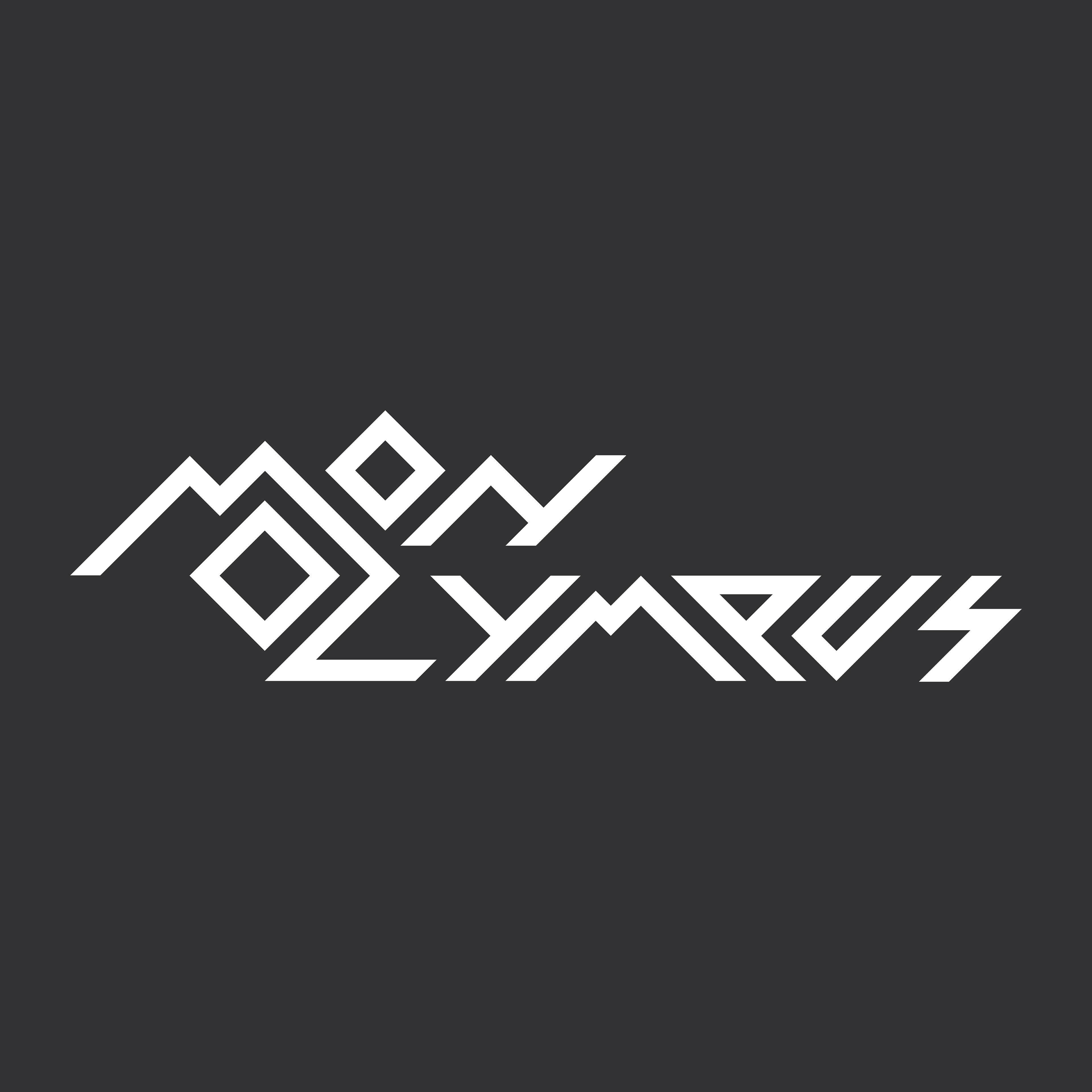
The wordmark draws on the steep slopes of Mount Olympus, glyph-inspired characters, and a lightning bolt symbolising the power of Zeus.
The logomark features a Spartan helmet draped in the Nemean Lion pelt from Hercules’ first labour, forming a sigil that embodies a warrior’s strength and resilience.
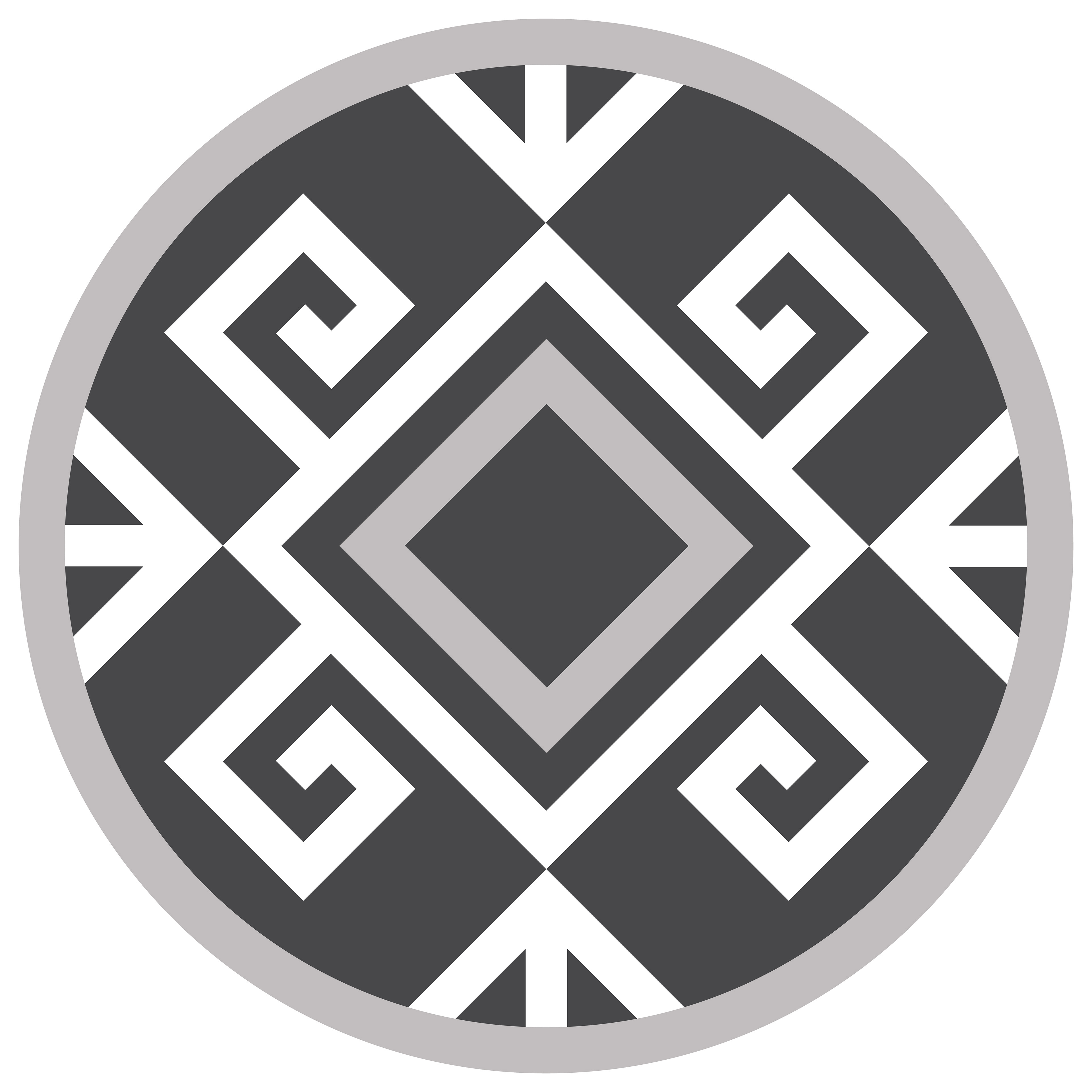
ICONOGRAPHY

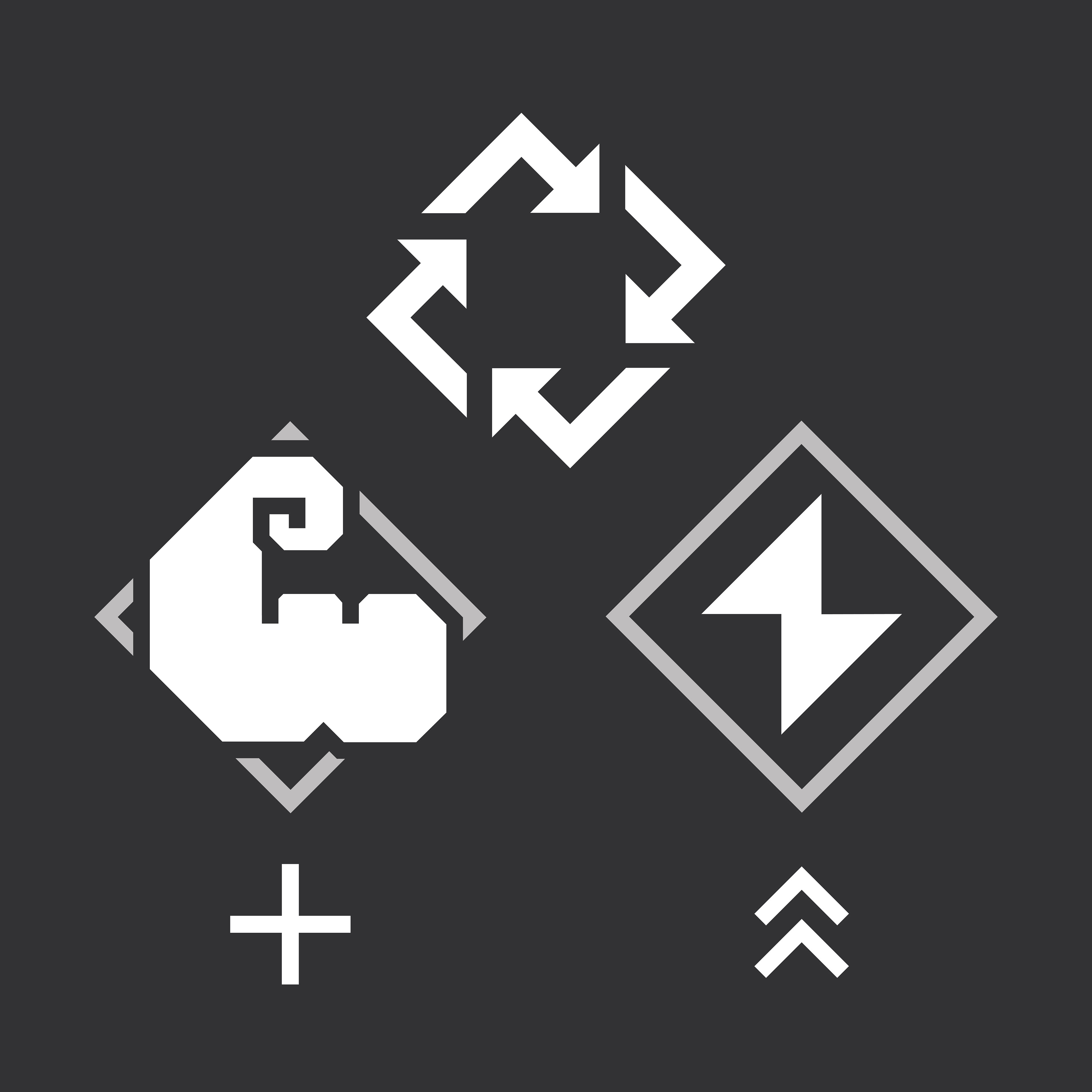
The olive branch wreath, awarded to ancient Olympic victors, symbolises athletic triumph, while the kylix, a shallow handled cup from ancient Greece, references celebration. I also designed geometric vector graphics for recycling, muscle mass, and explosive energy.
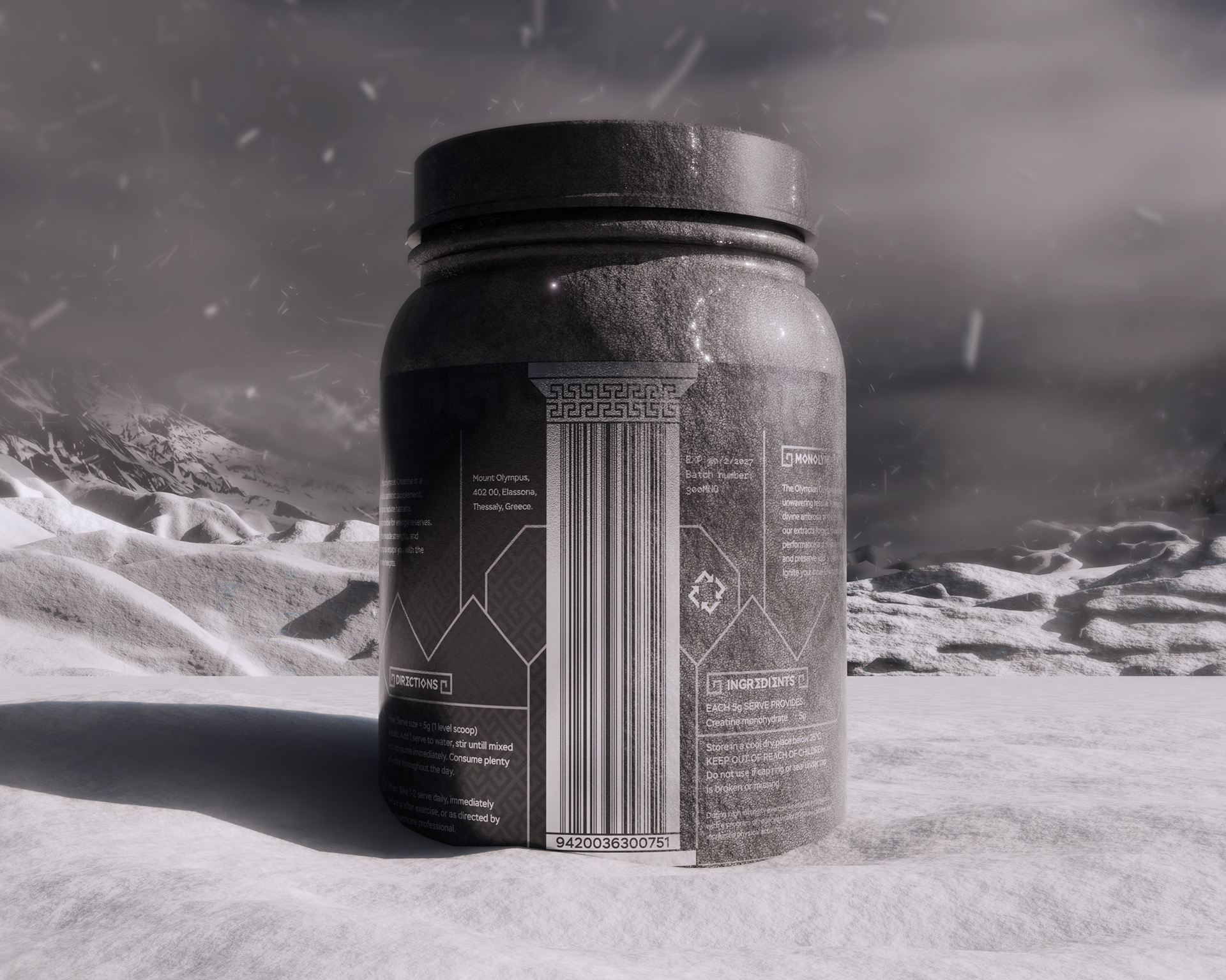
BARCODE & PATTERN
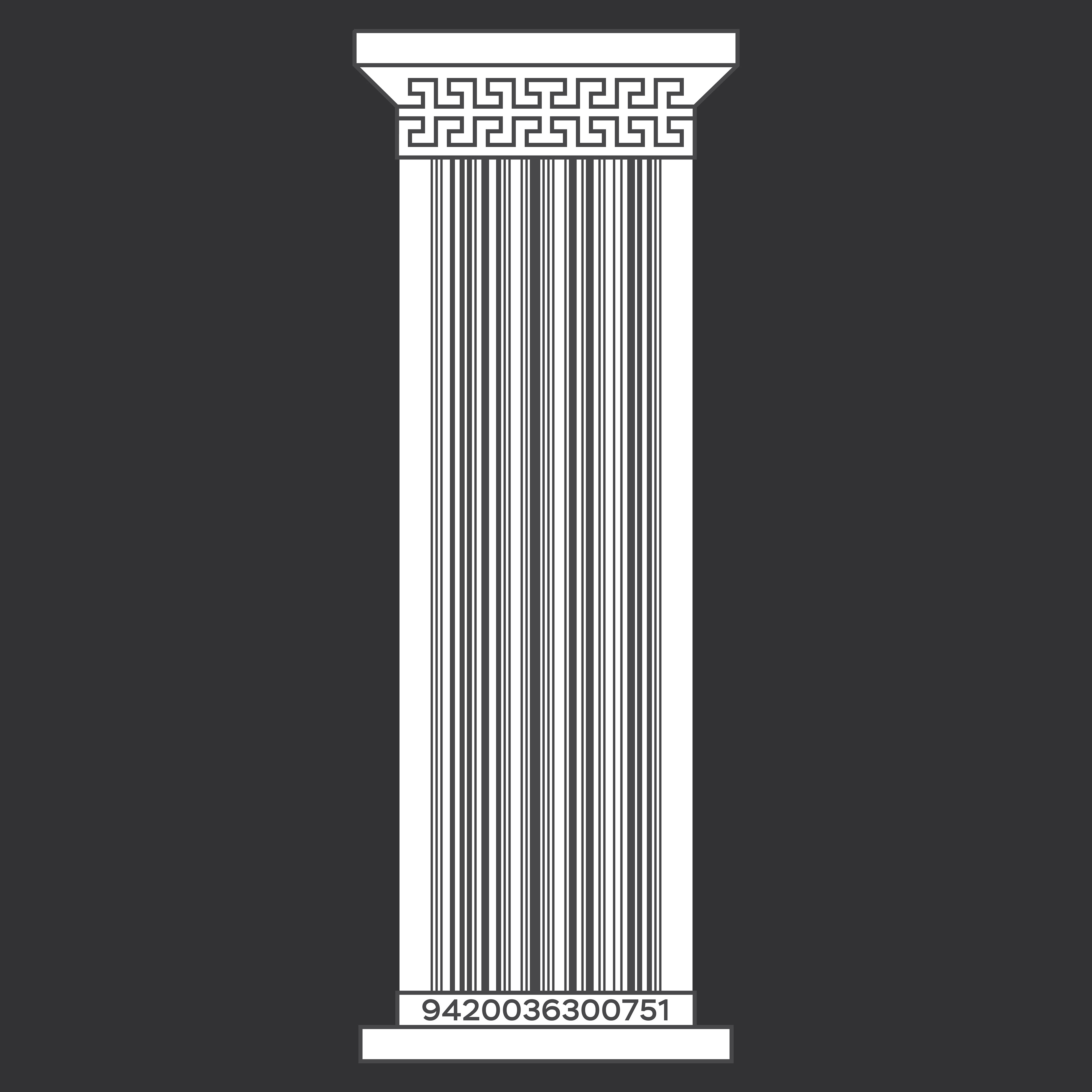

My barcode concept was inspired by a Greek column, forming the foundation that “held” the packaging together. I designed it to scale, ensuring full compliance with GS1 requirements, including bars, numbers, and colour space, and it was awarded 3rd place in GS1’s Barcode Design Awards 2024.
The Meander, a continuous spiral motif symbolising heroism and resilience in Greek culture. Using an angular grid system, I developed the unique Monolympus pattern.
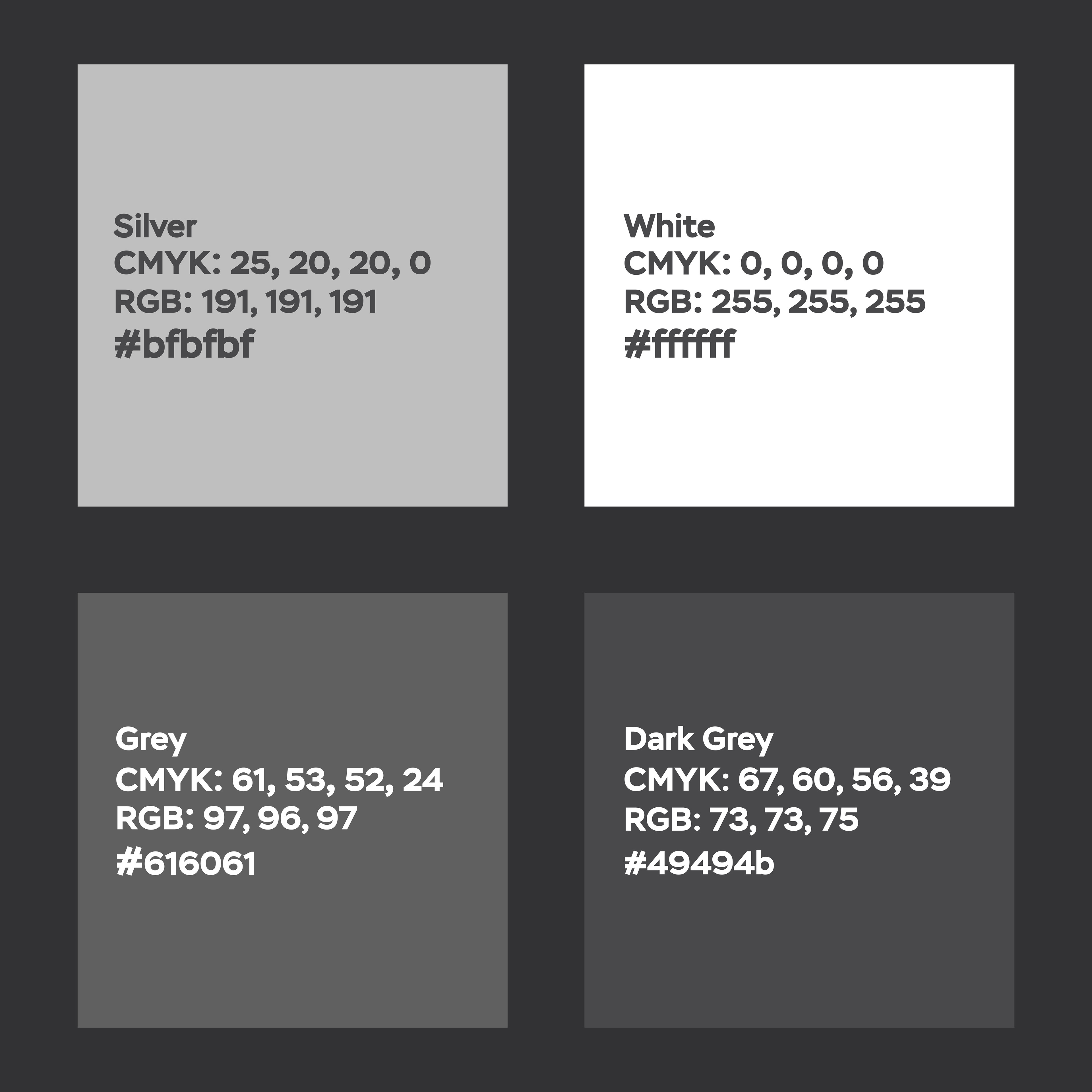
COLOUR & TYPE
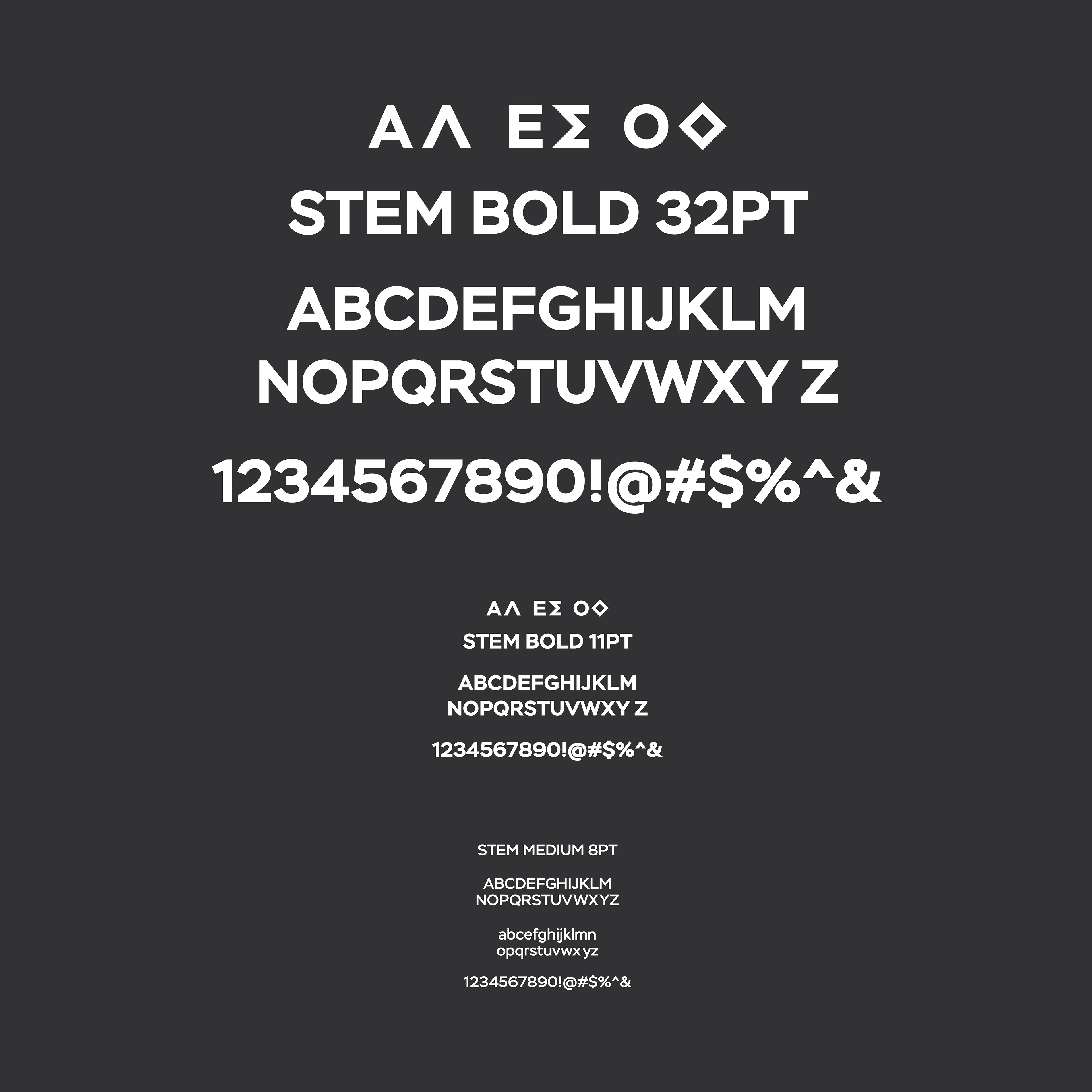
I designed individual letters to echo Greek characters, transforming ‘O’ into a diamond-shaped glyph, ‘A’ into a Lambda, and ‘E’ into a Sigma.
The restricted monochromatic palette of white, silver, and grey reinforces Monolympus’ striking visual identity, evoking purity, devotion and Grit.